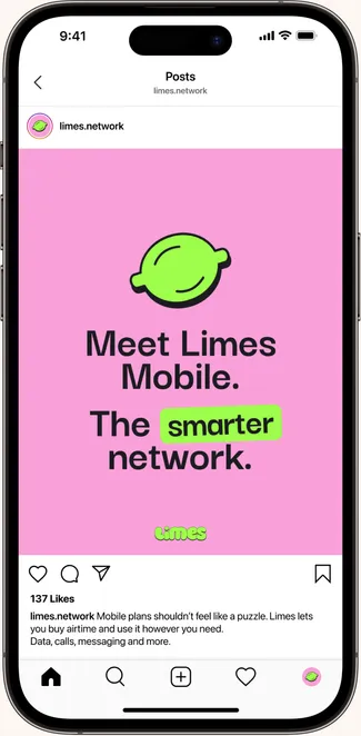
Limes Mobile
Designing for a new South African mobile network.
For people and businesses who want more flexibility and choice. Because, in Cupcake's economy, who wants to pay for things they don't need?
Brand | Product | UX | UI | Copy | Strategy
The hand we were dealt
The client approached us to launch a new mobile network in one of South Africa's most competitive industries. But instead of asking how to compete with the big players, we asked a different question: why does buying airtime still feel like a compromise?
People don't use their phones the same way every day, yet they're expected to buy airtime and data as though they do. A handful of dominant players have shaped the rules of the category, and even newer entrants tend to follow the same playbook.
The result is often more choice on paper, but very little freedom in how people actually buy, use, or think about their mobile services.
Our Approach
Creative
We wanted flexibility to feel obvious.
So we stripped away the complexity and designed a playful, memorable identity that makes the product easy to understand, remember, and choose.
Strategy
We needed to challenge the category by shifting the conversation away from buying airtime and towards buying control. The strategy centered on giving people the freedom to pay only for what they actually need.
The Logo
Fun, playful, memorable.
Built to feel light in a category that feels cold and serious.

The Colours
Designed to stand out instantly.
- Black
#2B2A32 - White
#FFFFFF - Lime
#8FFF41 - Pink
#FF9CDC - Blue
#4D9EFF - Purple
#D4A6FF - Yellow
#FFD800
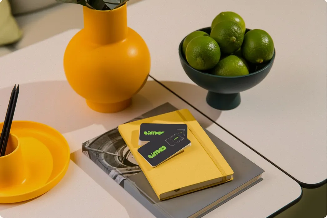
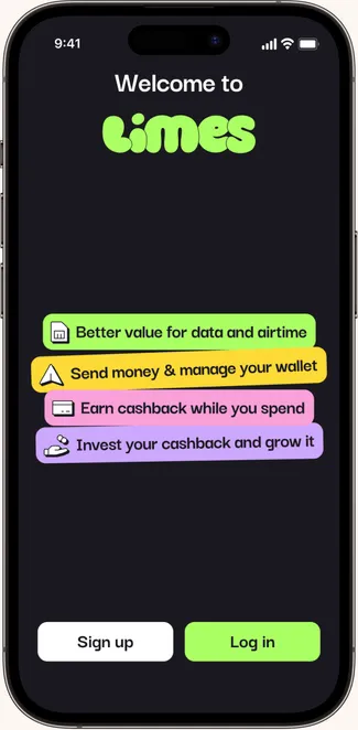
Control, by design
A product experience that makes flexibility feel effortless. Built for real-life usage.
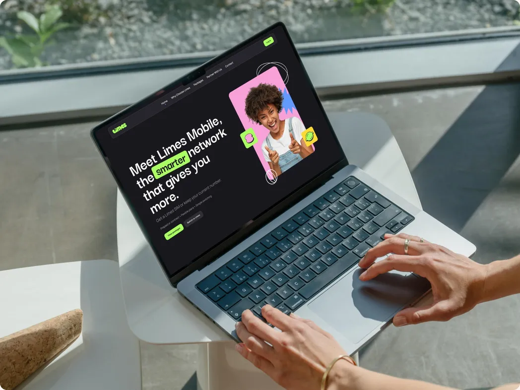
Social Media that stops your scroll while teaching you Limes maths ;)
Scroll-stopping creative that turns a functional product into something people actually get. Simple, visual storytelling that makes the value obvious in seconds.