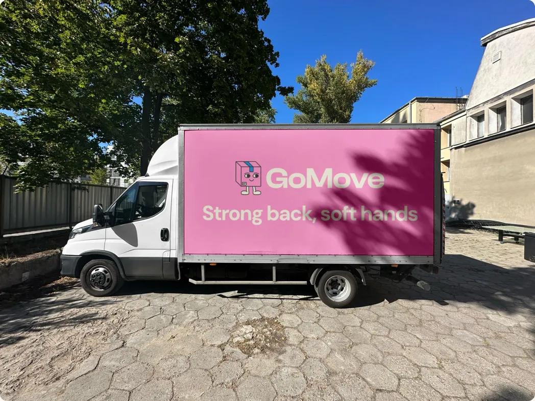
GoMove
Rebuilding how South Africans move.
A tech-enabled moving brand designed to remove the chaos from move day.
Brand | Product | UX | Copy
The hand we were dealt
The client approached us with an existing brand that needed to be refreshed, relooked, and repositioned. We needed to relaunch this brand with a new name and identity. So we asked ourselves: why would anyone care about a moving company? Well, the physical act of moving isn't only a logistical exercise.
People move for a ton of reasons—circumstances that may be happy, sad, chaotic, and more. But it feels like the industry treats it as something purely logistical, transactional, and functional.
Our Approach
Creative
We wanted a brand that’s easily recognisable, and speaks to the physical and emotional parts of moving.
Strategy
We knew we wanted a clear and trustworthy brand.
Route 01

We started with the most recognisable symbol of moving: the cardboard box.
Flip it over, and it becomes an isometric room interior—transforming the logo from a symbol of packing up into one of settling in.
A simple device that captures both sides of moving: the physical move of leaving one space behind and the emotional transition of beginning life in another.
Route 02
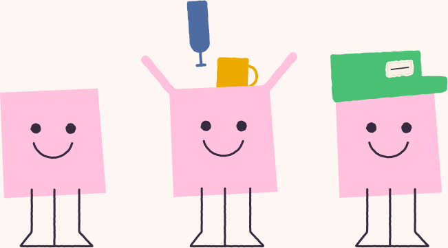
We explored a mascot-led route to bring more personality to the brand.
Built from the moving box itself, the character gave GoMove a recognisable face that could build familiarity across every customer touchpoint.
Friendly, memorable, and instantly associated with moving.
The winning hand (final route)
Each route answered a different challenge. The final identity brought the strongest thinking together into a brand that was bold, memorable and built for the long haul ;)
The Logo
Simple and memorable by design.
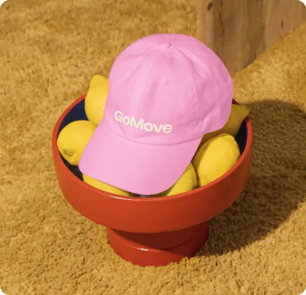
A confident wordmark built for scale, legibility, and real-world visibility.
Colour does the heavy lifting so the logo doesn't need to.
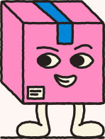
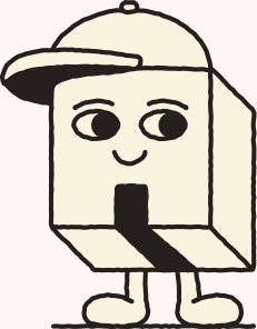
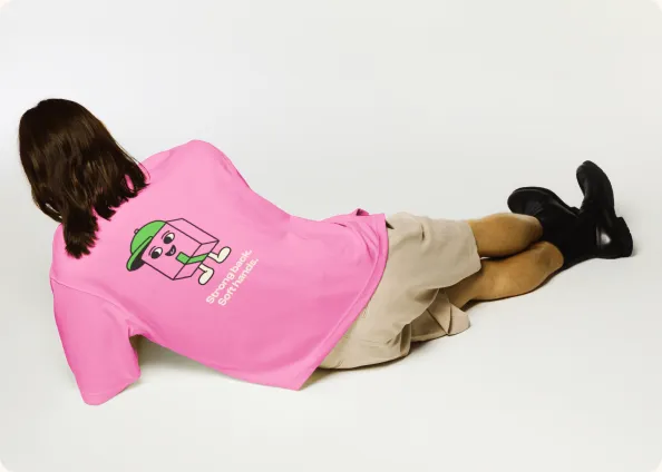
Meet Joe Move
A mascot designed to bring warmth and personality to the brand.
Joe Move became the recognisable brand asset that could show up wherever GoMove did.
Calm, capable and just cheeky enough to make moving feel a little less stressful.
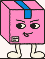
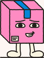
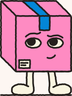
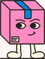
Customer Mascot
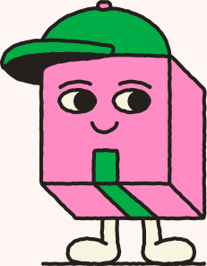
Driver Mascot
The Colours
Bright. Happy. Stops your scroll.
- Black
#25201D - Cream
#F9F4E0 - Pink
#FE8BC2 - Blue
#0386D7 - Green
#01AD47 - Yellow
#FEC200
The Illustrations
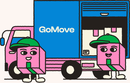
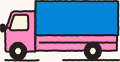
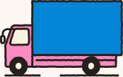
Moving is messy and never goes to plan. So our illustrations aren't perfect either.







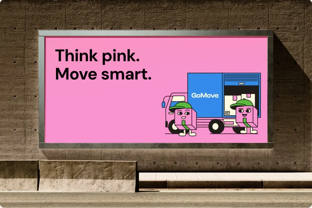
How GoMove shows up
Confident. Clear. Slightly cheeky. Never careless.
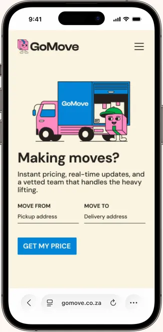
Designed to remove friction
Designed mobile-first, because that's where the customer is.
The goal?
Trust before the truck arrives.
A clearer customer journey. A system built to scale. A strong foundation for growth.
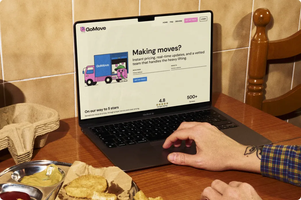
A system, not a campaign
Moving is a full experience. It doesn't start at booking or end when the truck leaves.
So we built a system that supports the entire journey.
Designed around real customer behaviour, across every touchpoint, from first click to move day.
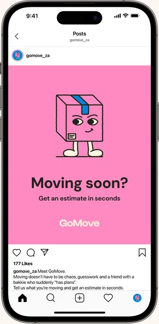
Social Media
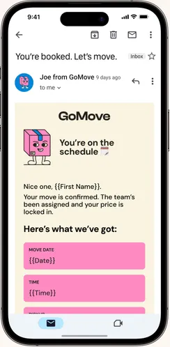
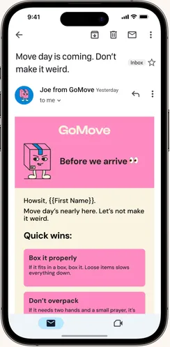
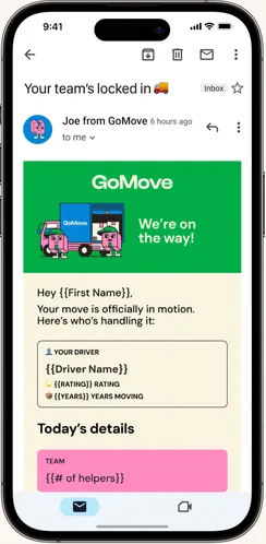
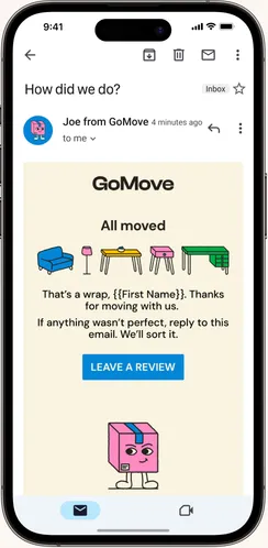
Trigger Emails
Truck Design